
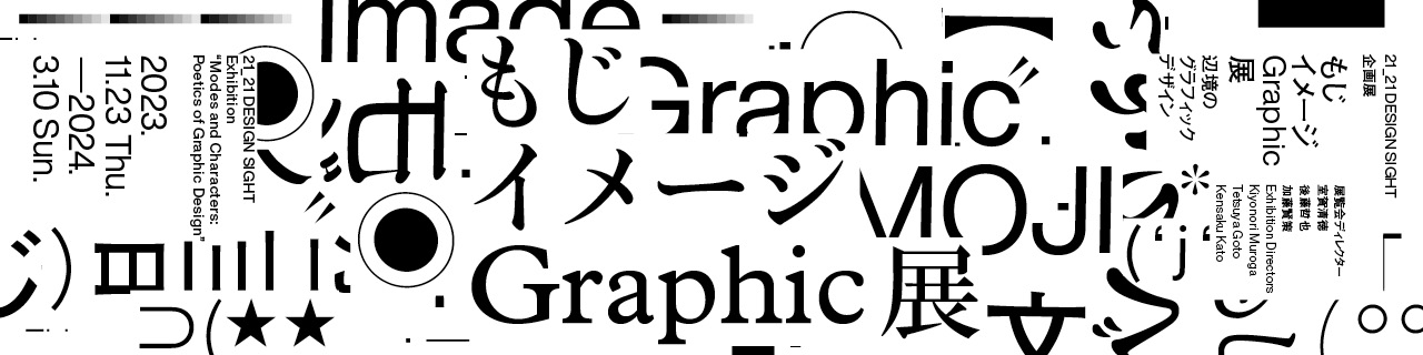
contents
Directors
Currently, graphic design has increasingly been homogenized on an international scale. It appears that the design world is now governed by a system in which every designer in the world uses the same applications to organize information and solve related problems at low costs.
But design, which has developed as an area spanning art and technology, has aspects that are based on sensibility and, therefore, cannot be articulated logically. Also, the English words "graphic" and "design" originated from human activities in which humans left some marks on the surrounding environment to send meaningful messages.
This exhibition is designed to let visitors observe such workings of design in the responses of Japan's design to the global design movements in the late 20th century and thereafter which originated in the Western world.
Current globalization cannot be explained away as mere Westernization. Rather, it is based on a dynamism that enables the mixing of various regional cultures and the interpretation of alien cultures. An example is emoji, which was born as a feature of Japanese cell phones and has subsequently been introduced to the global communication system.
When discussing Japanese design amid such dynamism, realities in the modern world cannot be dealt with simply by invoking "Japan's traditional aesthetic consciousness" as in the past.
Considering this point, I would like to focus on the relationship between characters and design. Japan has developed an original communication system in which Chinese characters, hiragana, and katakana are combined to suit various modes of representation. This system has given birth to layouts through which characters and images mingle freely.
What design possibilities have emerged in this age when characters are usually written horizontally, through exciting contacts between global information structure and Japanese characters? I hope that visitors will find an answer to this question at the exhibition site.
Kiyonori Muroga
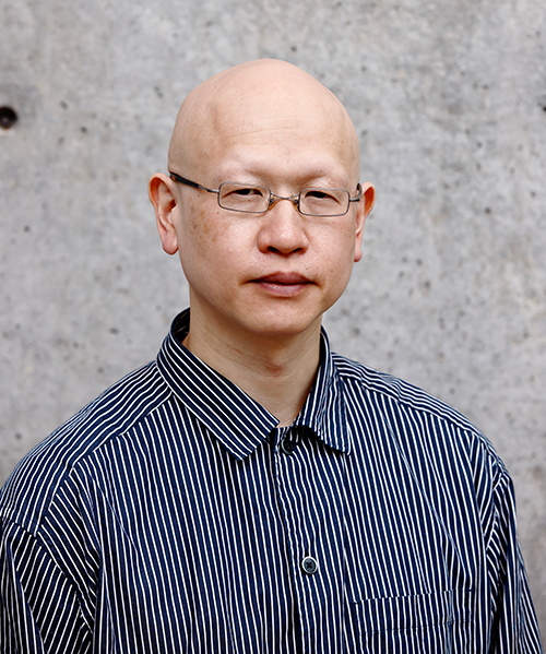
Kiyonori Muroga
Editor at Graphic-sha Publishing. Born in Nagaoka, Niigata Prefecture in 1975. Kiyonori Muroga has engaged, in the international scene, in the planning and editing of books on graphic design, typography and visual culture, and related critical and educational activities. Chief editor of "The Graphic Design Review" (JAGDA). Former chief editor of "Idea" (Seibundo Shinkosya). Co-author of "Graphic Design Guidebook" (Graphic-sha Publishing) and other books. Adjunct instructor at Tokyo University of the Arts and Musashino Art University.
I have participated in the planning of more than 10 graphic design exhibitions. Each time, I keenly felt the difficulty of holding an exhibition themed on graphic design. As graphic design functions in our daily life, it isn't naturally suited for exhibition in white cubicles. While each artwork shown in an exhibition is unique (or has only a limited number of originals), graphic design works are produced on the supposition that they are copied an unlimited number of times. So, the latter's exhibition could produce a bizarre space, as if people were worshiping something they could toy with as soon as they were outside the site.
It is necessary to connect the design with a new context to show the dynamism of graphic design by annulling the borderline between the ordinary environment and the exhibition space. Past success stories include the use of references to old objects (i.e., quotations or samplings) and the demonstration of processes in which design works are formed. This exhibition attempts to design a new context of graphic design, starting from the 1980s/90s, which are the endpoints of most design history books, by stitching together the facets of visual communication scattered in the post-digital age.
The central theme of the exhibition is "characters and images." You can say that illusions created by them represent the fundamental working of graphic design. How can images be produced in this post-digital age through visual communication in its wider sense, transcending rationality as a requirement for modern design? I hope that by connecting the dots between the various visual communication functions in everyday life to provide a wide vista of graphic design, the exhibition will not only serve to showcase graphic design works, but also offer visitors the opportunity to contemplate the enduring vitality that graphic design will maintain amid changing times.
Tetsuya Goto
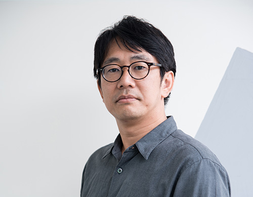
Tetsuya Goto
Designer / Curator / Editor. Director of Out Of Office. Associate professor at Kindai University (Faculty of Literature)/ Visiting professor at Osaka University of Arts. Member of the editorial board of JAGDA's "The Graphic Design Review" (JAGDA). He has published "K-GRAPHIC INDEX" (Graphic-sha Publishing) and "Yellow Pages" (an extra number of Idea) (Seibundo Shinkosha).
Typojanchi (Culture Station 284, 2013 & 2015), Fragments of Graphism: An Alternative History of Graphic Design in Japan (Creation Gallery G8, 2018), GRAPHIC WEST 7: YELLOW PAGES (kyoto ddd gallery, 2018), FIKRA GRAPHIC DESIGN BIENNIAL 2018 (Sharjah, 2018), Identity no Kiki (A-Lab, 2020), GRAPHIC WEST 9: Sulki & Min (kyoto ddd gallery, 2021), New Identity (A-Lab, 2021), ddd DATABASE 1991-2022 (kyoto ddd gallery, 2022)
https://outofoffice.jp/
This exhibition focuses on modern visual communication, mainly by presenting sample works of graphic design in the 1990s and thereafter. In the 1990s, DTP came to be widely used in graphic design. Also, many designers began to derive design outputs from programming, and produce interactive representations on the Internet.
In those days, I, as a student, was excited about new representations resulting from the advent of digital media and the Internet. At the same time, I was enthralled by famous graphic designers, legendary even at that time, who were active mainly from the 1960s to the 80s.
I think that the common element in such a movement is visual communication based on the Japanese language, which is the critical theme of this exhibition. It may be that graphic designers in those days updated their environment through their imagination while tackling modern design, for example, just as we are doing while tackling digital media.
The style of writing in Japanese, comprising Chinese characters, hiragana, katakana, alphabets, horizontal and vertical writing, and rubies, is more complex than in any other part of the world. So much so that I am surprised to see it used by so many people as something natural. It is a demanding task for designers to handle and control all these elements. But if they can look at this complexity as richness and take a positive attitude to it, they can never have a more enjoyable environment.
I hope that visitors will enjoy the rich world of visual communication based on the Japanese language through viewing exhibits.
Kensaku Kato

Kensaku Kato
Graphic designer / Art director. Representative of Laboratories Co., Ltd. Kensaku Kato has worked in many graphic and editorial design projects related to art museums and exhibitions, including: art direction of "Idea" (Seibundo Shinkosha), a graphic design magazine; "Fashion in Japan 1945-2020 - Fashion and Society" (The National Art Center, Tokyo, 2020); "Olafur Eliasson - Sometimes the river is the bridge" (Museum of Contemporary Art Tokyo, 2020); "Egon Schiele" (Tokyo Metropolitan Art Museum, 2023); "Objects of Man Ray" (Kawamura Memorial DIC Museum of Art, 2023); "Roppongi Crossing 2022: Coming & Going" (Mori Art Museum, 2023); "Bruno Munari: The Man Who Made Useless Machines" (The Museum of Modern Art, Kamakura & Hayama and other museums, 2018); production of the logo and signs for Hachinohe Art Museum (2021). Planning of "Idea 370 Special Feature: Thought and Design" (Seibundo Shinkosha, 2015); exhibition plan for "Fragments of Graphism: An Alternative History of Graphic Design in Japan" (Creation Gallery G8, 2018); etc. Adjunct instructor at Musashino Art University.
www.labor-atories.com